Markets continued to climb the wall of worry during the third quarter as returns were positive across the board, although downside volatility did creep back in during September. Stocks in general were up between 4 and 7% during the quarter in the US while emerging market equities were up nearly 10%, helped by a nearly 4% decline in the value of the US Dollar. The NASDAQ continued to outperform the broad market, appreciating 11% for the quarter – again driven by the FAANG stocks – which were up 28% for the quarter (though both were down 5% in September). Fixed income markets were marginally positive with the long end of the US Treasury curve down a bit. Venturing beyond the US Treasury market (as we like to do) saw positive returns in the mid-single digits from asset classes such as high yield (+4%); emerging market debt (+3%) and preferreds (+5%). Commodities were also up mid-single digits, led by a 28% rally in Silver.
We now turn to some of the changes made to your portfolios over the last quarter1. I will start with the punchline in case you find the rest of this letter too boring. The recent flood of liquidity injected into the global economy that we have discussed in prior letters is likely to be enough to rekindle inflation. As such, we believe that interest rates have seen their lows for this cycle, growth stocks are quite vulnerable to rising interest rates and commodity prices will rise more than expected over the next several years. The changes to your portfolio in early August manifested themselves as a reduction in growth stock exposure, a negative position on treasury yields (where appropriate) and the addition of an ETF with broad commodity exposure.
Now for the why. In its simplest form, inflation, or the rate at which the average price of goods or services increases over time, can happen if the money supply (M3) grows faster than economic output (GDP) under otherwise normal economic circumstances. This is known as the Quantity Theory of Money which proposes that the exchange value of money is determined like any other good, by supply and demand. Below is a chart which looks at this relationship over the last 50 years.
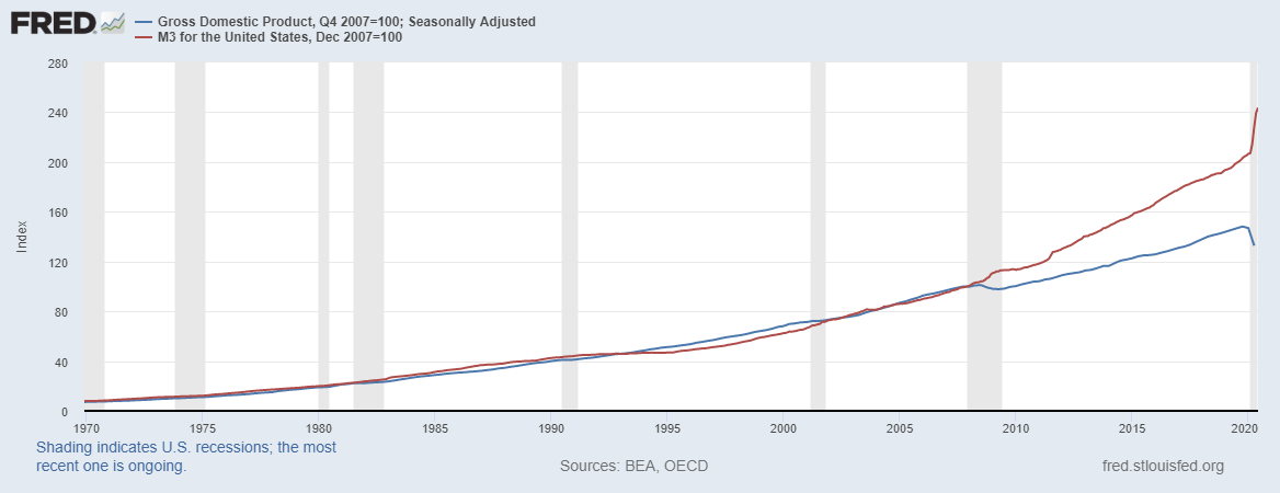
After growing largely in lockstep for 40 years, these two series began to diverge after the Financial Crisis of 2008-09. More recently, the liquidity injection in response to COVID-19 has been rather dramatic as the growth of Money Supply has gone “vertical”. Looking at this chart compelled us to dust off and update a chart we created way back in 2010 (as we were beginning to recover from the Financial Crisis) which looked at the impact of both fiscal and monetary stimulus after our economy emerged from a recession. This chart was an attempt to understand “where does the money go” when the government “spends” its way out of a recession. As you can see, when the government has jump-started the economy in the past, most asset classes do well but there are some significant differences.
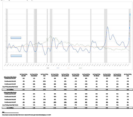
In general, small cap and value stocks outperform large cap and growth stocks after a period of significant fiscal and monetary stimulus. Gold’s performance is dependent on the underlying inflation conditions. Fixed income performance is, as you might imagine, dependent on the direction of interest rates: underperforming in a rising rate environment and outperforming when rates are dropping.
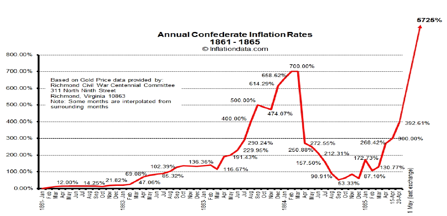
Although we do not anticipate a hyper-inflationary period, it is at least instructive to review such periods in history. One of the more dramatic was the hyper-inflationary period in Germany from 1920-1923. At the end of World War I, Germany was required to pay reparations to the United States and various European countries (France, Belgium, U.K.) as punishment for their “aggressions” in addition to the monies it borrowed to finance the war effort. These reparations amounted to approximately 25% of their GDP at the time and was to be paid in either gold or foreign currency. In response, Germany took themselves off the Gold Standard and began printing money to “buy” gold and foreign currency to meet its obligations. The result was a rapid decline in the value of the German Mark and a rapid increase in prices (inflation) within Germany. At the end of the war, one US Dollar was worth 4.2 German Marks. By the end of 1923, one US Dollar was worth 4,210,500,000,000 German Marks. Here is how it looks graphically.
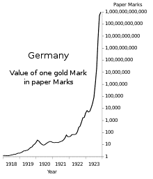
While clearly problematic between 1918 and 1922, the real damage occurred in 1923, which represents a rather eerie parallel to today. In late 1922, Germany was no longer able to secure enough gold and foreign currency to pay an installment of their reparations and thus, was in default. In response, French and Belgian troops occupied the Ruhr Valley, which was the industrial heartland of Germany at the time. The theory was that the occupying troops would commandeer the output of the factories in lieu of payment via gold and foreign currency. In response, the German government ordered the factory workers “not to help the invaders in any way” – aka “passive resistance” or a general strike. While a nice change of pace vs. taking up arms, the workers still needed to be paid to prevent mass starvation and civil unrest. So, the German government ran the currency printing presses 24 hours a day to pay the workers while they sat at home – sounds vaguely familiar, doesn’t it?
The comparison in our previous example was the Mark vs. the Dollar – but what if we want to look at the Dollar’s buying power over time. In that case, we can turn to comparing the Dollar to gold. Below, is a chart which looks at the Dollar’s buying power vs. gold since the birth of our country. Back in 1792 and up until 1933, the United States was on the Gold Standard, so if you had $10,000 you could buy 500 ounces of gold. That’s approximately 140 years of price stability. Between 1933 and 2020, the amount of gold you could buy for that same $10,000 fell to 5 ounces. As you can see by the chart, there is a strong correlation between this loss of purchasing power (gold line) and the increasing percentage that government spending represents of total GDP (orange line).
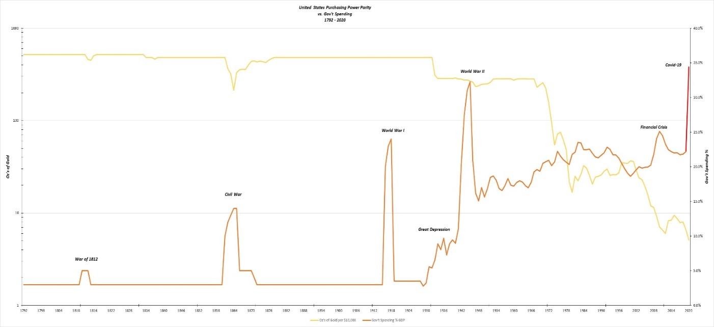
In case you were wondering what happened during that little dip which occurred during the Civil War period, this country had its own bout with hyperinflation as the Confederate States printed their own money to finance the war which wasn’t backed by gold and caused a period of misery within the South.
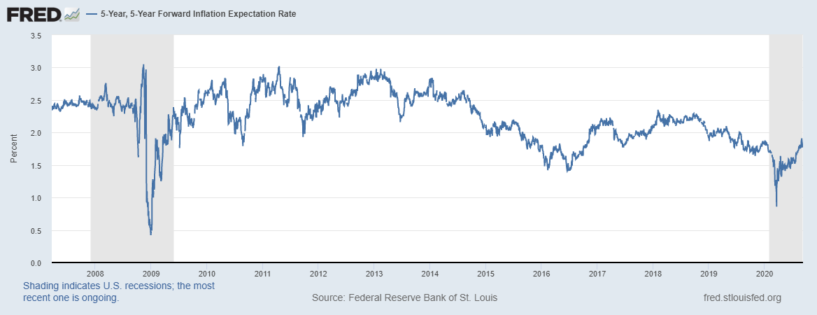
The bottom line is that inflation expectations are on the rise – much like the period after the 2008-2009 Financial Crisis. The chart below looks at the last 13 years and illustrates the clear rise in recent inflation expectations.
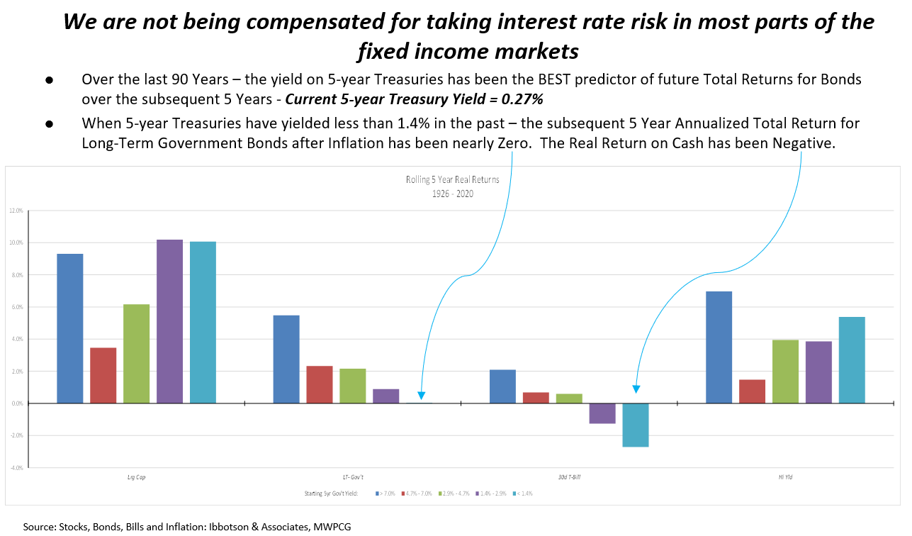
Rising inflation expectations do not mix well with record low interest rates. In fact, the starting yield is a strong predictor of future total returns within the fixed income market as detailed in the chart below, which we have put together using over 90 years’ worth of data.
Although we have taken a long journey through the history books, allow me to bring us back to today. What is most disconcerting to me is the relative distortions in the markets brought on by the period of low interest rates we have just experienced and now, the rapid increase in the US money supply. While bond duration is fairly well known as a measure of interest rate sensitivity (the higher the duration, measured in years, the greater the sensitivity a bond has to changes in interest rates), the same concept can be applied to stocks as well. While I will spare you the mathematical derivation, it can be shown that the reciprocal of dividend yield is an accurate approximation for equity duration. The chart below looks at changes in equity duration (interest rate sensitivity) of three sectors of the US equity market – Technology, Staples, and Utilities – when compared to the 10-year Treasury Yield (Gray) since 2015.
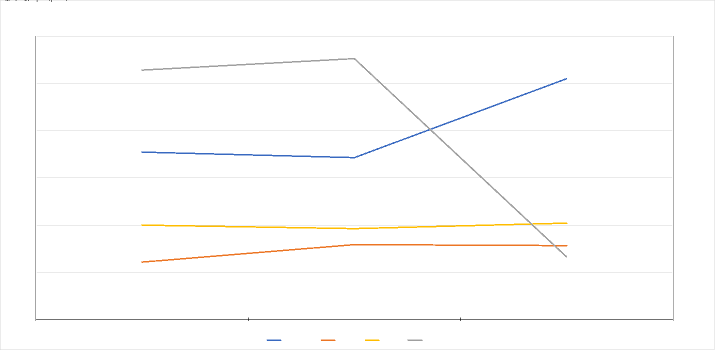
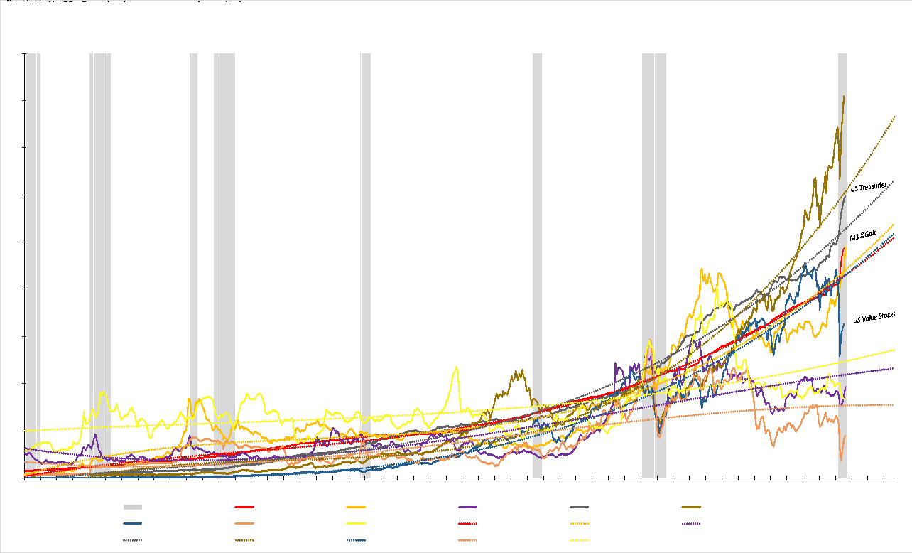
As you can see, technology stocks, which dominate the growth stock indices, are by far the most vulnerable to a rise in long-term interest rates with an equity duration of over 102 years. To put this into further perspective and tie it to the portfolio changes described at the beginning of this letter, please focus your attention on the following graph which looks at asset class prices versus their long term, trend-line relationships. You may notice how this chart captures events such as the crude oil price run-up of the late ‘70s (orange line), the Internet Bubble of 1999 (brown line/US Growth Stocks) or the general run-up in commodity and precious metals prices after the 2008-’09 Financial Crisis as the Federal Reserve flooded the economy with liquidity. Today, the two most above trend asset classes are US Growth Stocks and US Treasuries. The two most below trend asset classes are US Value Stocks and Commodities as represented by copper, crude oil, and corn.
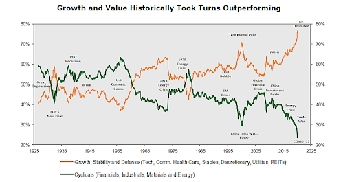
Below is another, longer-term look at the Growth vs. Value tug of war. As you can see, the current yawning gap between Growth and Value is the worst in nearly 100 years! It is for all these reasons that we made the portfolio changes previously described and represents the basis of our current thinking regarding how your portfolios should be positioned.
We at Measured Wealth hope you and your family remain healthy and enjoy the upcoming holiday season. Please call or email if you have any questions.
Steve Bruno, CFA
Chief Investment Officer
October 1, 2020
Disclaimer: Historical data is not a guarantee that any of the events described will occur or that any strategy will be successful. Past performance is not indicative of future results.
Returns citied above are from various sources including Bloomberg, Russell Associates, S&P, Dow Jones, MSCI Inc., The St. Louis Federal Reserve and Y Charts, Inc.